NPS vs User Research: What Metrics Don’t Tell You
Most product teams operate with a dangerous blind spot. They celebrate a 72 NPS score while their users silently abandon the checkout flow. They doom-scroll through promoter comments looking for validation while ignoring the quiet friction killing conversion rates. The Net Promoter Score has become the industry standard for measuring customer loyalty, but here’s what keeps me up at night: teams make million-dollar decisions based on a number that tells them almost nothing about their actual users.
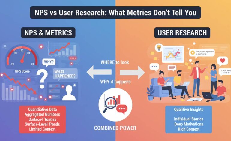
I’ve spent fifteen years in user research, and I’ve watched companies pour resources into improving NPS scores only to watch key metrics stay flat or decline. The problem isn’t that NPS is useless—it’s that teams treat it as comprehensive when it’s actually a single data point that misses the vast majority of what matters about customer experience. User research catches things that no survey question can capture, and understanding the gap between these two approaches is the difference between building products users love and building products users merely tolerate.
The fundamental problem with single-number metrics
NPS asks one question: “How likely are you to recommend this product to a friend or colleague?” Respondents answer on a zero-to-ten scale, and you calculate the difference between the percentage of promoters (9-10) and detractors (0-6). The result is a single number that fits nicely on a dashboard and gives executives something to tweet about.
The problem is that this single number collapses enormous complexity into something meaningless. A user who gives you a 9 because they love your onboarding experience and a user who gives you a 9 because they feel locked in are indistinguishable in your data. A user who gives you a 3 because of a billing error and a user who gives you a 3 because your core feature set doesn’t match their workflow needs appear identical in your NPS report.
Consider what actually happens when someone responds to an NPS survey. They’re answering based on their most recent interaction, their general mood, their comparison to alternatives they tried years ago, and a dozen other factors that have nothing to do with the specific experience you’re trying to measure. The timing of when you send the survey matters enormously—a user who just resolved a support ticket will answer differently than the same user two weeks later, even if nothing about your product changed.
Hotjar’s research on NPS limitations points out that the metric was designed for a specific purpose: predicting business growth through word-of-mouth referrals. It was never intended to be a comprehensive measure of customer experience or a diagnostic tool for product improvement. Using it for those purposes is like using a thermometer to diagnose which organ is failing.
What NPS can’t capture: context and emotion
NPS gives you a number, but it never tells you why. A score of 45 could mean you’re crushing it with a small segment while alienating everyone else. It could mean your product is excellent but your billing practices are infuriating. It could mean nothing changed at all—maybe your survey timing shifted and you’re now catching users at a different point in their journey.
User research catches the context that makes numbers meaningful. When you watch someone attempt to complete a task in your product, you see the micro-frustrations that never make it into any survey. You see them hesitate before clicking, mutter something under their breath, or abandon a flow entirely without reporting anything. These moments don’t register in NPS, but they accumulate into experiences that turn promoters into detractors.
The emotional dimension is equally invisible to metrics. A user might recommend your product because it solved an urgent problem, even though the experience was frustrating and time-consuming. They’re willing to recommend it because they had no better option, not because you delivered something exceptional. NPS treats both this user and a genuinely enthusiastic fan as equivalent—you get a 10 from both, but your product strategy should be completely different based on what drove those scores.
Medallia’s research on NPS limitations emphasizes that the metric misses the emotional context that drives actual behavior. A user who gives you a 7 because they’re mildly satisfied behaves completely differently from a user who gives you a 7 because they’re afraid of change. Without understanding the “why” behind the score, you’re flying blind.
The illusion of actionable insights
Here’s where NPS becomes actively dangerous: it creates the illusion that you’re measuring something actionable when you’re actually just collecting a number to feel good or bad about. When NPS improves, teams declare victory. When it declines, they scramble to find some initiative to blame. But neither response is actually connected to understanding what users need.
The follow-up question in NPS surveys—”What is the primary reason for your score?”—seems like it would solve this problem. It doesn’t. Open-ended responses at scale are nearly impossible to analyze systematically. You can read every comment if you have fifty responses, but most companies have thousands. Natural language processing tools can help with categorization, but they miss nuance, sarcasm, and context that human analysis would catch.
Even when you do analyze follow-up comments, you’re getting filtered feedback. Users only tell you what they consciously recognize and bother to articulate. They won’t mention that your button color made them slightly uncertain about whether it was clickable. They won’t describe how the loading time made them check their internet connection multiple times. They won’t explain that your checkout flow reminded them of a frustrating experience with a competitor. These invisible friction points are exactly what user research reveals, and exactly what NPS obscures.
The gaming problem and response bias
NPS is notoriously easy to game, and I mean that in multiple ways. Companies time their surveys to catch users at peak satisfaction. They exclude users who are likely to give low scores. They segment their data to show only favorable cohorts. The metric has become so embedded in corporate performance reviews that actual customer experience often takes a back seat to score optimization.
Response bias is equally problematic. Users who respond to NPS surveys are not representative of your entire user base. They’re either highly satisfied or highly frustrated—everyone in the middle deletes the email. This means your NPS is actually measuring two things: how your product performs and how likely certain users are to take surveys. When you improve NPS, you can’t tell whether users are actually happier or just more motivated to respond.
Survey fatigue compounds this problem. Users receive so many NPS requests that they’ve learned to answer quickly without much thought. Harvard Business Review has documented how NPS scores can actually increase during periods when users are least engaged with your product, simply because only the most enthusiastic fans bother responding. Your score goes up while engagement goes down—a perfect recipe for strategic misalignment.
What user research actually catches
User research methods capture dimensions of experience that no survey question can reach. When you conduct user interviews, you hear the unfiltered language people use to describe their problems. You discover that users don’t think about your product the way your team does—they have different mental models, different terminology, different priorities. This qualitative understanding is impossible to extract from any survey.
Usability testing reveals friction that users themselves don’t recognize. People adapt to problems they’ve learned to work around. They develop workarounds that feel normal. They blame themselves for not understanding your interface when the interface is actually poorly designed. Only by watching them try to accomplish tasks do you see these adaptation patterns, and only then can you fix the underlying issues.
Contextual inquiry—observing users in their actual work environment—shows you things users would never think to mention in a survey. The interrupted phone call that made them lose their place in your flow. The second monitor they need because your dashboards don’t fit on one screen. The colleague they have to ask for help because your permission system doesn’t make sense. These context-specific insights are precisely what drive the differences between products users tolerate and products users love.
Customer journey mapping synthesizes these insights into actionable understanding. Rather than measuring a single touchpoint, you trace the entire experience from first awareness through ongoing use. You identify moments of truth where small improvements create disproportionate impact. You find the invisible handoffs where users fall out of love with your product. No NPS score could ever reveal any of this.
Counterintuitive insights: when NPS gets it wrong
Here’s what most articles on this topic don’t tell you: NPS sometimes works, and qualitative research sometimes misleads. There are genuine limitations to user research that honest practitioners acknowledge.
Sometimes NPS is exactly right. When your score tanks after a major outage or a controversial pricing change, users are telling you something important. The metric fails not when it detects problems but when it claims to explain them. A sharp NPS decline is a signal to investigate, not a diagnosis to act on directly. The mistake is treating the number as sufficient rather than as a trigger for deeper inquiry.
Conversely, user research has its own biases. Interview subjects perform for researchers—they want to be helpful, they assume the researcher wants to hear positive things, they rationalize decisions they’ve already made. Observation in artificial environments never captures the full reality of daily use. The best product decisions come from triangulating multiple data sources, not from replacing NPS worship with research worship.
The most valuable insight is actually simpler: you need both. NPS at its best serves as an early warning system—a broad signal that something has changed in your user experience that deserves investigation. User research provides the diagnostic capability to understand what changed and what to do about it. The fatal error is treating either in isolation.
Beyond NPS: metrics that actually help
If NPS isn’t enough, what should you measure instead? The answer depends on what you’re trying to learn, but some alternatives deserve serious consideration.
Customer Effort Score (CES) measures how easy it is to accomplish specific tasks. Developed by researchers at Gartner, CES asks users to rate how easy or difficult it was to complete a particular interaction—make a purchase, find information, resolve an issue. The insight here is that loyalty is driven more by ease than enthusiasm. Users will stick with a product that’s merely acceptable if it’s effortless to use. They’ll abandon a product they love if it requires too much work.
Customer Satisfaction Score (CSAT) measures satisfaction with specific interactions rather than overall relationship. Unlike NPS, CSAT can be targeted to particular touchpoints, giving you diagnostic power. After a support interaction? CSAT. After the onboarding flow? CSAT. After a feature release? CSAT. The granularity is valuable even if the metric itself is less trendy than NPS.
Behavioral analytics fill gaps that any survey-based metric cannot. When you track what users actually do—what features they use, where they drop off, how their behavior changes over time—you’re measuring actions rather than stated intentions. The correlation between what people say they’ll do and what they actually do is notoriously weak. Mixpanel and Amplitude have made product analytics accessible to companies that would never have hired a data science team.
Building a better measurement system
The path forward isn’t to eliminate NPS but to contextualize it within a broader measurement framework. Start with NPS as a broad health indicator—something you check monthly to understand overall trajectory. When the number changes significantly, treat it as a signal to investigate rather than a problem to solve.
Layer in targeted metrics for specific decisions. Planning a checkout redesign? Measure task completion rates and time-on-task in your research, then track conversion rates afterward. Releasing a new onboarding flow? Compare CSAT scores before and after. Launching into a new market? Look at region-specific data rather than global averages.
Invest in ongoing qualitative research even when nothing seems wrong. The most valuable user research often happens when metrics look healthy—the kind of discovery that reveals opportunities before competitors see them. Quarterly user interviews, regular usability testing, systematic analysis of support conversations—these practices build institutional knowledge that pays off during crisis moments.
Where this leaves us
The honest truth is that no single metric captures what matters about customer experience. NPS isn’t going away—it’s too embedded in corporate culture and executive expectations. But treating it as a comprehensive measure of user sentiment is a strategic error that costs companies millions in missed opportunities and preventable churn.
The teams that get this right don’t choose between quantitative and qualitative approaches. They use NPS to spot trends, user research to understand causes, behavioral data to validate changes, and targeted metrics to measure specific initiatives. They treat their measurement system as a living thing that requires ongoing attention and refinement.
What keeps me up at night isn’t that NPS is flawed—every metric is flawed. It’s that teams become confident in numbers that are actually hiding more than they’re revealing. The score looks scientific. The dashboard looks professional. The quarterly review has a clear metric to discuss. But beneath that surface clarity lies enormous uncertainty about what actually drives user behavior. That’s the gap between metrics that make you feel informed and research that actually helps you make better products.
The question isn’t whether NPS misses things—it clearly does. The question is whether you’re building the research muscle to catch what your metrics can’t see.