How to Use the System Usability Scale (SUS) Correctly
The System Usability Scale remains the most widely used usability questionnaire in the world, yet I see practitioners get it wrong almost every week. They administer it incorrectly, misinterpret the scores, or set unrealistic expectations for what the metric can tell them. This isn’t a complicated tool — Brooke designed it to be simple — but “simple” doesn’t mean “effortless to use correctly.” If you’re going to put this questionnaire in front of your users, you owe it to both the data and the people answering your questions to understand how the SUS actually works, where it falls short, and why the typical benchmark of 68 doesn’t mean what most people think it means.
This guide covers everything you need to deploy the SUS properly: the exact questionnaire, score calculation, interpretation frameworks, participant requirements, and the mistakes that undermine the entire measurement process. I’ll also push back on a few pieces of conventional SUS wisdom that I’ve found to be misleading in practice.
What is the System Usability Scale (SUS)?
The System Usability Scale is a 10-question questionnaire developed by John Brooke in 1986 (and published formally in 1996) as a quick way to assess the perceived usability of a system. It’s not a comprehensive usability audit — it doesn’t measure learnability, efficiency, or error rates directly. What it measures is users’ overall perception of a system’s usability, condensed into a single score between 0 and 100.
The reason it has survived nearly four decades is its efficiency. Ten questions take most respondents three to five minutes to complete. The scoring is straightforward. And despite its simplicity, the SUS correlates surprisingly well with other, more elaborate usability metrics. Brooke himself was skeptical about whether something so brief could be useful, but the evidence over the years has consistently proven him wrong.
What the SUS does not do is tell you why your score is what it is. It’s a diagnostic tool, not an investigative one. You get a number — say, 72 — but that number doesn’t explain whether users struggled with navigation, found the terminology confusing, or were frustrated by loading times. For that understanding, you need qualitative methods: interviews, task analysis, or think-aloud protocols. The SUS tells you that you have a usability problem, not what the problem is.
This distinction matters more than most practitioners realize. I’ve seen teams celebrate a score of 82 without realizing their system has serious accessibility failures that a diverse user population would flag immediately. The SUS captures perceived usability among the users who completed it — nothing more, nothing less.
The 10-Question SUS Questionnaire
The SUS consists of 10 Likert-scale items, each scored from 1 to 5. The questions alternate between positively and negatively framed statements, which respondents rate on a scale from “Strongly Disagree” to “Strongly Agree.”
Here is the exact questionnaire as it was originally published:
- I think that I would like to use this system frequently.
- I found the system unnecessarily complex.
- I thought the system was easy to use.
- I think I would need technical support to use this system.
- I found the various functions in this system were well integrated.
- I thought there was too much inconsistency in this system.
- I would imagine most people would learn to use this system quickly.
- I found the system very cumbersome to use.
- I felt very confident using the system.
- I needed to learn a lot before I could get going with this system.
Note that questions 2, 4, 6, 8, and 10 are negatively framed. If a respondent gives a 5 on question 2 (“I found the system unnecessarily complex”), that actually indicates poor usability — but the scoring formula converts it so that higher final scores always mean better usability. This is a common source of confusion when people try to analyze individual responses.
One thing Brooke clarified in later discussions: these questions are deliberately generic. “This system” can refer to anything — a website, a mobile app, a medical device, an internal tool. The questions don’t specify what aspect of usability they’re measuring, which is both the SUS’s greatest strength and its most significant limitation. It gives you a broad-brush score but sacrifices the specificity you’d get from purpose-built questionnaires like the QUIS (for user satisfaction) or the USE Questionnaire (for usefulness, ease of use, and ease of learning).
How to Calculate SUS Score (Step-by-Step)
The SUS scoring process is straightforward once you see how it works, but it’s not intuitive on first encounter. Here’s the step-by-step method:
Step 1: Convert each response to a score from 0 to 5. For positively worded questions (1, 3, 5, 7, 9), subtract 1 from the response. For negatively worded questions (2, 4, 6, 8, 10), subtract the response from 5.
So if a respondent gave question 1 a rating of 4, its contribution would be 4 – 1 = 3. If they gave question 2 a rating of 2, its contribution would be 5 – 2 = 3.
Step 2: Sum all converted scores. Add the values from all 10 questions. The maximum possible sum is 40 (10 questions × 4 points each after conversion).
Step 3: Multiply by 2.5. This converts the 0-40 scale to a 0-100 scale. A sum of 32 becomes an SUS score of 80.
That’s it. The formula is:
SUS Score = (Sum of converted responses) × 2.5
A few important details that trip people up:
First, the SUS score is not a percentage. A score of 80 does not mean users found the system 80% usable. It’s an arbitrary scale that happens to run from 0 to 100. The interpretation comes from benchmarking against other systems, not from the raw number.
Second, you cannot calculate a meaningful SUS score from fewer than 10 responses. Each questionnaire must be complete. If someone skips a question, you either exclude that respondent or handle the missing data according to a documented imputation method — but be transparent about that in your reporting.
Third, SUS scores are not normally distributed. They tend to cluster in the 60-85 range, which means the arithmetic mean can be misleading if you have a small sample. Some researchers recommend using the median instead, particularly for samples under 20.
Interpreting SUS Scores — What Makes a “Good” Score?
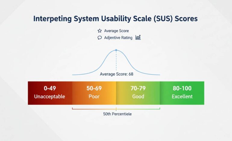
The most commonly cited benchmark is that 68 is the average SUS score. This figure comes from a meta-analysis of over 500 studies by Sauro and Lewis (2012), and it’s the reference point most UX professionals use.
Here’s the interpretation framework most practitioners work with:
- Below 50: Poor usability. Users are significantly dissatisfied.
- 50-70: Below average. There’s meaningful room for improvement.
- 70-85: Good usability. The system is above average.
- Above 85: Excellent. Users are highly satisfied.
But here’s the thing most articles won’t tell you: this framework is too crude to be useful in isolation. A score of 72 on the SUS tells you almost nothing actionable. It doesn’t tell you whether the problem is in the first use experience, in completing complex tasks, or in error recovery. It doesn’t tell you whether certain user populations score drastically differently than others.
What the benchmark does do is let you compare over time and against competitors. If your current system scores 62 and your redesign scores 74, that’s meaningful progress. If your competitor’s product scores 78 and yours scores 72, you have a legitimate usability gap to address.
There’s also a counterintuitive issue with the 68 average that rarely gets discussed: the average is inflated because poorly designed systems rarely get evaluated with the SUS. Think about it — if a system is so bad that users abandon it immediately, they’re not completing your usability questionnaire. The 68 benchmark is an average among systems that were deemed important enough to evaluate, which means “below average” is less catastrophic than it sounds.
A more nuanced interpretation comes from Bangor, Kortum, and Miller (2009), who developed adjective ratings that correspond to SUS ranges:
- Below 50: “Poor”
- 50-62: “OK”
- 62-80: “Good”
- 80-90: “Excellent”
- Above 90: “Best”
Use these adjectives to contextualize your scores in reports. Telling stakeholders “we scored 74, which is in the ‘good’ range” is more meaningful than saying “we scored above the average of 68.”
Common Mistakes to Avoid When Using SUS
I’ve identified five recurring errors that undermine SUS measurements. These are the things that separate someone who “used the SUS” from someone who used it correctly.
Mistake 1: Administering the SUS after a usability test without accounting for priming. If users just spent 45 minutes performing structured tasks and you then ask them to rate the system, their responses will be heavily influenced by the specific tasks they just completed — not their overall impression of the system. The original SUS was designed for standalone administration, not post-task questionnaires. If you must administer it after a test, use neutral framing in your introduction and consider asking about “the system you just used” rather than the user’s general perception.
Mistake 2: Comparing SUS scores across different contexts without adjustment. A score of 65 for a complex enterprise dashboard is very different from a score of 65 for a consumer e-commerce checkout. Internal tools typically score higher because users are forced to use them and have no alternative. Consumer apps face higher expectations and more competitive alternatives. The same score can mean very different things depending on the context.
Mistake 3: Using the SUS for formative design guidance. This is perhaps the most fundamental misunderstanding. The SUS gives you a summative metric — it tells you the outcome of your design decisions after they’ve been made. It does not tell you what to change. If your SUS score is 58, the questionnaire cannot guide you toward improving it. You need to run additional studies to discover the underlying issues. I’ve seen teams waste months trying to “fix” a low SUS score without ever doing the discovery work that would actually improve usability.
Mistake 4: Averaging scores from fundamentally different user groups. If you have power users scoring 85 and novice users scoring 45, the average of 65 conceals a serious problem. Segment your SUS results by user group. Look at the distribution, not just the mean. A bimodal distribution where half your users love the product and half hate it will produce a deceptively average score.
Mistake 5: Running the SUS once and treating it as definitive. SUS scores have a margin of error, just like any other metric. With a sample of 10 users, the confidence interval around your score is roughly ±12 points. That means a score of 72 could actually represent a true score anywhere between 60 and 84. If you’re making high-stakes decisions based on SUS scores, you need larger samples or longitudinal data across multiple administrations.
How Many Participants Do You Need?
This is one of the most frequently asked questions about the SUS, and the honest answer is “it depends on what you’re trying to do.”
For a quick benchmark check with reasonable confidence, 8-10 participants will get you a statistically stable score for comparing against known benchmarks. Bangor’s research suggests that 8-10 users produce SUS scores within about 5 points of the true population mean with 80% confidence. That’s often sufficient for understanding where you stand relative to the 68 average.
For comparing two systems (such as an A/B test or a before/after redesign), you’ll need at least 12-15 participants per condition to detect a meaningful difference. A meta-analysis by Taylor (2019) suggested that detecting a 10-point SUS difference with 80% power requires roughly 16 participants per group.
For establishing your own internal baseline where you’ll track changes over time, aim for 20-30 respondents to reduce the margin of error and capture the natural variation in your user population.
The one thing you should absolutely not do is run the SUS with 3 or 4 users and treat the resulting score as definitive. I’ve seen this happen in organizations that want a “quick check” — they get a score of 71, feel good about it, and make decisions that cost thousands of dollars based on a number that has a margin of error larger than the gap between “good” and “excellent.”
There’s also a practical consideration that doesn’t get enough attention: who you’re recruiting matters as much as how many. If your SUS respondents are all usability experts who evaluate systems for a living, they’ll give you different scores than typical end users. The benchmark of 68 was established with diverse, non-expert users. Using internal team members or UX professionals as respondents will inflate your scores artificially.
SUS vs Other Usability Metrics
The SUS is not the only usability questionnaire available, and understanding when to use it — and when to choose something else — is part of using it correctly.
SUS vs. QUIS (Questionnaire for User Interface Satisfaction): The QUIS, developed at the University of Maryland, is more detailed than the SUS and measures satisfaction with specific interface elements (screen layouts, terminology, learning). Use QUIS when you need diagnostic information about specific interface components. Use SUS when you need a quick overall score and don’t need to know which elements are causing problems.
SUS vs. USE Questionnaire: The USE Questionnaire measures three distinct dimensions: Usefulness, Ease of Use, and Ease of Learning. It’s more informative than the SUS for understanding what users find lacking, but it takes longer to administer (15 questions minimum). If you’re comparing specific design attributes, USE provides more actionable data. If you need a single comparable metric, SUS is more efficient.
SUS vs. CSAT (Customer Satisfaction Score): CSAT is typically a single question (“How satisfied are you with X?”) scored on a 5-point scale. It’s faster than SUS but less reliable and less informative. CSAT is useful for ongoing operational monitoring; SUS is better for research-backed benchmarking.
SUS vs. Single Ease Question (SEQ): The SEQ asks users to rate how easy a specific task was on a 1-7 scale immediately after completing it. It’s become popular because it takes three seconds. But SEQ measures task-level perceived ease, not system-level usability perception. They’re measuring different things. Use SEQ alongside the SUS if you want both task-level and system-level data.
The SUS’s advantage has always been its efficiency and its benchmarking heritage. You can compare your score directly against thousands of other systems in published datasets. No other questionnaire has that breadth of comparable data. That’s why the SUS remains the standard for organizational-level usability reporting, even when more detailed instruments exist.
Industry-Specific SUS Benchmarks
The global average of 68 masks significant variation across industries. If you’re comparing your healthcare application’s SUS score against a consumer gaming app without adjusting for context, you’re making an invalid comparison.
Here are benchmark ranges I’ve compiled from published studies and the UXPA’s benchmarking database:
- B2B Software (enterprise applications): Average around 72-78. Users are often constrained to these tools and have higher tolerance for complexity because they have no alternative.
- E-commerce websites: Average around 65-75. Consumer expectations are high, and competitive alternatives are always one click away.
- Mobile applications: Average around 68-80. The platform maturity matters significantly — iOS apps consistently score slightly higher than Android apps in comparative studies.
- Government and civic tools: Average around 60-70. These systems often serve diverse populations with varying technical literacy and face significant accessibility challenges.
- Healthcare systems: Average around 62-72. The complexity of medical workflows pushes scores down, though patient-facing portals tend to score higher than clinical systems.
- Financial services: Average around 68-76. Trust and security perceptions influence responses significantly.
These ranges are approximate, and the variation within any industry is often larger than the variation between industries. But they provide useful context. If your internal enterprise tool scores 70, you’re actually performing slightly below the average for your industry — not above it, which is how the raw number might feel.
I want to be honest about a limitation here: industry-specific benchmarks are harder to find than most people expect. The published literature has concentrated on consumer-facing systems and enterprise software. If you’re measuring a niche tool — say, a scientific instrument interface — you may not have good benchmark data. In those cases, your best approach is to track your own scores over time and focus on change detection rather than external comparison.
Final Thoughts on SUS Mastery
The System Usability Scale is not a magic number. It doesn’t replace good UX research, and it won’t tell you what to build next. What it does — and does remarkably well — is give you a standardized, comparable metric for understanding how users perceive your system’s overall usability.
The practitioners who get the most value from SUS are those who use it as one data point among several, who track it over time rather than treating it as a one-time verdict, and who understand its limitations well enough to not overstate what the scores mean. A score of 74 is data, not a conclusion. It tells you where to look, not what you’ll find.
If you’re implementing the SUS for the first time, start with a clear question: “What do I need this score to tell me?” If the answer is “whether our redesign worked,” run it before and after with consistent methodology. If the answer is “how we compare to competitors,” recognize that you may not have perfect benchmarking data. If the answer is “what’s wrong with our interface,” skip the SUS entirely and run a qualitative study instead.
The scale works. The question is whether you’re measuring the right thing — and that’s a question only you can answer for your specific context.