Understanding the Difference Between X and Y Axis in Graphs
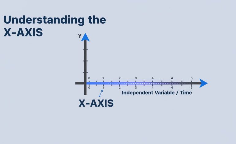
The x-axis runs horizontally (left to right), and the y-axis runs vertically (bottom to top). They intersect at the origin (0, 0). The x-axis shows independent values, while the y-axis shows dependent ones—so, that’s basically how they differ in a nutshell.
Why It Matters: Basics of X and Y Axes
Imagine a scatter plot: horizontal line, vertical line—those are your axes. The x-axis usually shows the input or cause, and the y-axis the output or effect. In everyday charts, you’ll see time or categories on the x-axis, and measurements, counts, or percentages on the y-axis. It’s like reading a simple story: left to right for the cause, then up for the result.
This basic difference helps everyone—from students to analysts—understand relationships. For example, in a temperature-over-time chart, time’s on the x-axis, temp’s on the y-axis. It just fits how we process info visually.
Anatomy of a Graph: What Each Axis Does
The X-Axis (Horizontal Line)
- Represents the independent variable—what you control or categorize.
- Common labels: time, categories (e.g., products, regions), or input values (like dosage).
- Serves as the baseline where data emerges or moves across.
The Y-Axis (Vertical Line)
- Represents the dependent variable—what you measure or observe.
- Shows outcomes like counts, percentages, temperature, speed, etc.
- Reflects how the input (x-axis) affects the result.
Hands-On Example: A Rainfall Over Months Graph
Say you plot rainfall by month:
– X-axis: months (Jan, Feb, Mar…).
– Y-axis: inches of rain.
Here, month is independent—you choose to view it. Rainfall depends on weather patterns, not the other way round. As a viewer, your eyes track from month → rainfall. Simple, intuitive, like reading a timeline of wetness.
When the Roles Flip: Alternative Uses
Sure, those are the usual roles. But sometimes we switch:
– A bar chart comparing product sales: categories (products) go on the x-axis; sales figures on the y-axis.
– In some scientific plots (like parametric curves), both axes are independent variables or represent coordinates (like a circle’s x and y values). It’s all about context—labels and captions tell the story.
Tips for Design: Using Axes Effectively
- Label clearly. “Time (days)” or “Revenue ($)”—no guessing.
- Start at meaningful points. Y-axis often starts at zero to avoid distortion.
- Scale wisely—consistent intervals avoid misinterpretation.
- Include gridlines or tick marks to help reading values precisely.
- Use colors or symbols to differentiate multiple data series.
These small choices make charts easier to read and more accurate. They reduce confusion and help readers draw correct conclusions—like spotting trends or comparing values.
Real-World Context: Business Tracking
A small online store charts weekly sales:
– X-axis: week numbers or dates.
– Y-axis: revenue in dollars.
At a glance, owners see if business is growing, dipping, or flat. They might notice seasonal patterns (holidays, weather effects) and act accordingly.
Swap axes mistakenly and the story breaks. Plotting revenue on x-axis and weeks on y simply looks wrong—hard to interpret, even misleading. So axis choice matters.
Quote from a Data Viz Expert
“A well-designed axis does more than mark a scale—it sets the tone for interpreting the entire chart. Clarity here avoids misreading later.”
That sums up why these details are worth paying attention to, whether you’re presenting to the board or just journaling your weekly runs.
Quick Comparison Table
| Axis | Orientation | Typical Use | Represents |
|————–|————-|——————————–|——————–|
| X-Axis | Horizontal | Time, categories, input values | Independent |
| Y-Axis | Vertical | Measurements, outcomes | Dependent |
It’s not rigid, but it’s your default. Deviations exist, but only when context clearly defines a different role.
Common Misunderstandings
- Switching axes is more than cosmetic. It changes how viewers interpret data.
- Starting y-axis above zero can exaggerate differences, unless visually justified.
- Assuming x-axis is always time can lead to misreading—always check labels.
A few seconds spent checking axis labels can save hours of misunderstanding later.
Conclusion – Key Takeaways
At its core, the x-axis runs horizontally and holds the cause or category (independent variable), while the y-axis runs vertically showing the effect or measurement (dependent variable). They intersect at the origin, forming the baseline for reading data visually. Clear labeling, sensible scaling, and consistency help ensure your graph tells the right story. Flip them, and you risk misreading or muddling what you’re trying to show.
FAQs
What if I swap x and y—will it matter?
It often will. Swapping axes changes interpretation. Audiences expect the independent variable on x. Deviate only with clear labeling.
Why does y-axis usually start at zero?
Starting at zero ensures proportionate visual comparison. Values above zero can mislead unless you clearly explain the focus range.
Can categories go on the y-axis instead?
Absolutely. A horizontal bar chart is a good case: labels on y, values on x. It flips but stays logical.
What’s the origin in a graph?
The point (0, 0) where axes meet. It’s usually bottom-left. That’s your reference point for both variables.
How do I choose axis intervals?
Pick even, consistent steps—like 10s or 5s—for easy reading. Irregular jumps confuse the pattern.
Should I always use gridlines?
Gridlines help but don’t clutter. Light, subtle gridlines improve precision. If you already have data labels, you can skip them.
Understanding x and y axes—sounds trivial, but it’s essential. Set them up right, label clearly, scale smartly. Your charts will guide readers—not confuse them.